


Today, the web is no longer limited to just computers. The rate of connection on mobile was in 2017 of 51.3%! Users therefore prefer to go online from their smartphone or tablet than from a computer. Companies that want to increase their web presence must therefore adapt. This means designing a website that can be viewed on any platform, without display problems. This is what we call a responsive site. What is it exactly? What are the advantages of responsive design? Answers in this article.
What is responsive design?
To make it simple, we can say that the responsive design is a particular technique of website creation. It allows the content to be viewed on any platform: PC of course but also smartphone, tablet or connected TV. The display then automatically adapts to the user’s screen size.

Reduced loading time
Previously, several formats had to be created separately: a classic website, one for mobiles and one for tablets. The site would then detect which device the user was connecting from and redirect them to the corresponding site. The loading time was therefore longer.
A single site for all screen sizes
The responsive design has brought a small revolution in the Web world: it is now possible to have a single site for several screen sizes and several different media. The font, the navigation buttons, the menu, the size of the images: all this is automatically adapted to each format. With no additional loading time and no special effort for the site administrator. Everything happens at the design stage. It is also possible to transform a classic website to a responsive design.
Why it is essential to have a responsive site
Whether you already have a website for your business or even a simple blog or you want to have one custom designed, it is essential to opt for the responsive design option. User habits have changed a lot in the last few years and there is no going back: mobile is the most important, while the computer is mostly used at work. And the web consultation on mobile is not limited to applications and social networks. Your prospects are searching for information and making purchases directly from their smartphone or tablet.
Internet users have no time to waste
But what if a customer comes across your site during a Google search or by clicking on an ad from their mobile device and arrives on a page with disproportionate images and unclickable navigation buttons? He will close the page and go to the competition. Internet users don’t have time to waste and won’t make any particular effort, even if your brand is reputable. You can’t expect them to visit your site from their computer if it’s not part of their habits.
Improve the user experience
Having a responsive design site is above all about facilitating the user experience. And this will have important repercussions on your business. Whether you sell products on an e-commerce site or whether your site is used to promote your business or to make appointments for example, it will be more efficient if it can be consulted from all media. Your conversion rate and even the recommendations of your customers to their friends will jump. Having a responsive design website designed or migrating your existing website to responsive means boosting your presence on the Web and investing in the success of your business.
Other major benefits of responsive design
Improving the customer experience of your website users is the major advantage of responsive design. But it is far from being the only one!
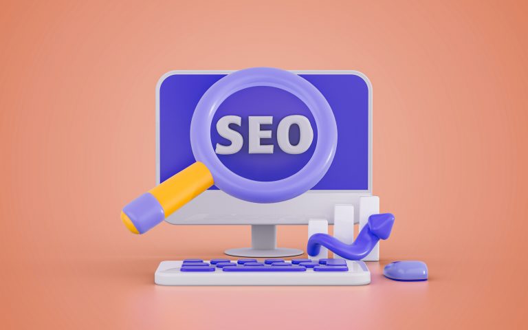
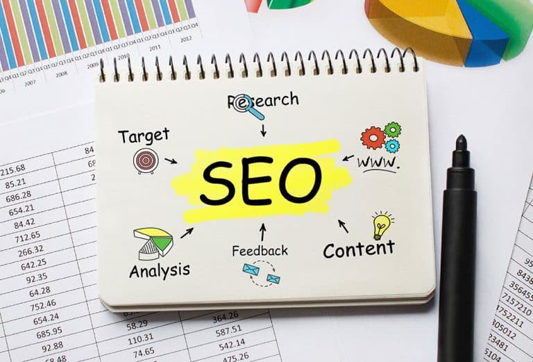
Be highlighted by Google
A responsive site will also allow you to be better referenced, that is to say to increase the visibility of your company on search engines like Google. If the improvement of the user experience is a central advantage of responsive, it is not the only one. Since 2015, the Mountain View firm has rewarded responsive sites with its Google Mobile Friendly algorithm. Sites that are perfectly adapted to the mobile and tablet format therefore appear in a better position in search results. This can significantly increase your visibility and therefore, ultimately, your revenue.
Reduce your operating costs
We were talking about responsive design as an investment. In reality, it can allow you to reduce your operating costs. To migrate your site in responsive will indeed cost you much less than to design a site by format (computer, smartphone, tablet). In these cases, you must also count three SEO operations. This can make your budget explode! All content must also be published on all three sites. If you have a blog section, it quickly becomes time consuming.
With responsive design, you will have only one site to design, reference and administer. Since it will increase your visibility, the (minor) investment will quickly pay off.
A step ahead of the competition
Last but not least, by starting now, you will be ahead of the competition. About a third of French websites are not yet responsive! If those of your competitors are not and you start, you can recover an important market share: that of mobile and tablet users. So, what are you waiting for to switch to responsive design?


