


This page gathers the articles published on our blog presenting great names and personalities of graphic design. We will present the great figures of graphic design and typography. The aim is to help you discover (or re-discover) those who have marked the history of our profession.
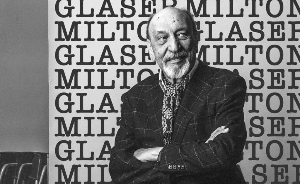
Milton Glaser, born June 26, 1929 in New York City, died on June 26, 2020, on his 91st birthday. The dial of his life closes its stopwatch with this ultimate mischief. In the meantime, he will have given the 70s and 80s a happy and offbeat face and in New York a reason to love him. His work is like the Bronx where he was born, vibrant and colourful, non-conformist.
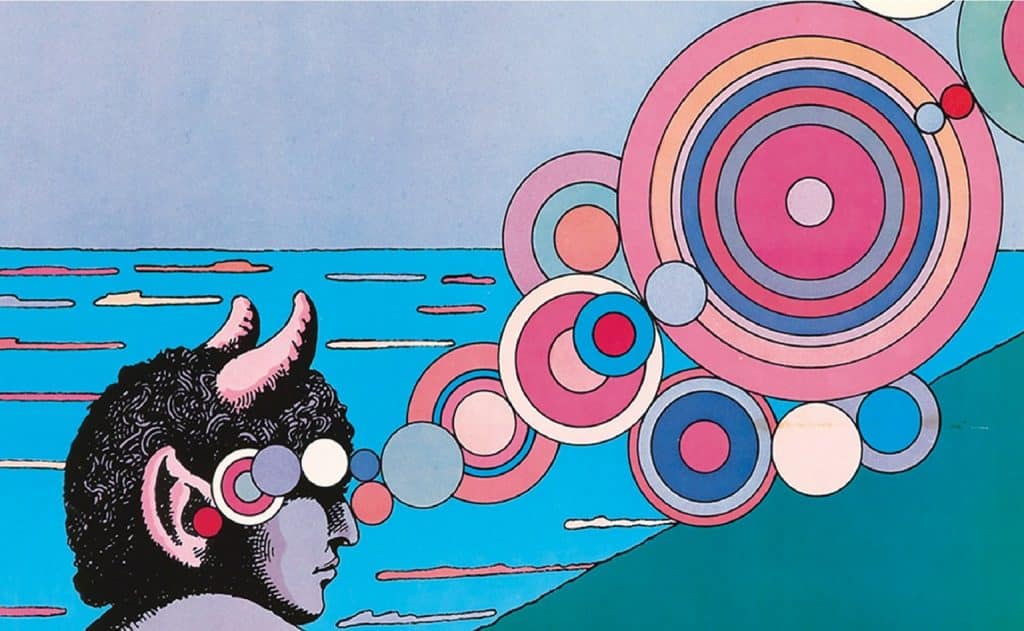
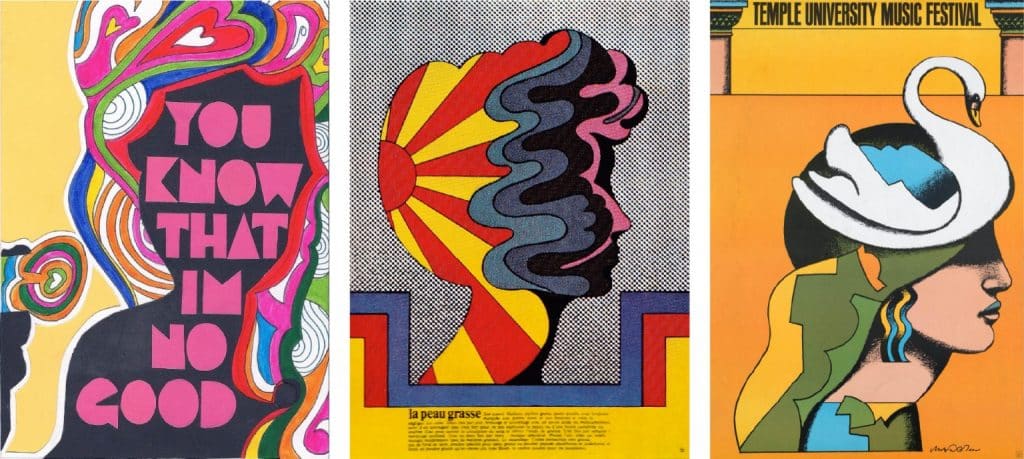
Among his best-known creations, true icons of design, are the logo “I ❤ NY” and the cover of Bob Dylan’s best-of depicting the singer’s profile with psychedelic hair. Let’s go into the story of a very, very big name in American design.
The Pushpin studio
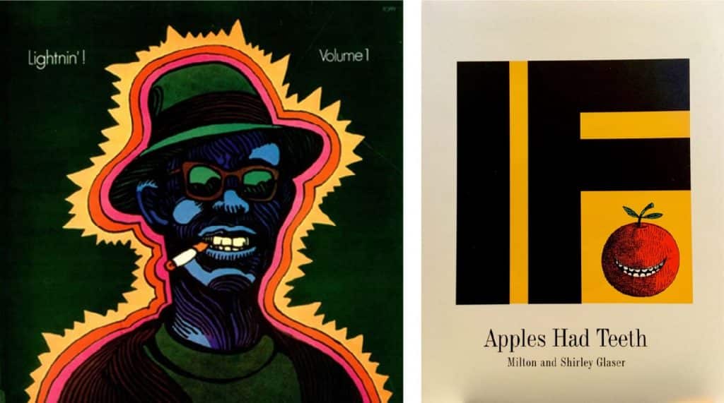
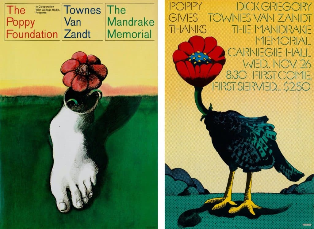
In 1950, even before graduating from the Cooper Union Art School in New York, Milton Glaser, with Reynold Ruffins, Seymour Chwast and Edward Sorel, founded their first studio. They were barely 20 years old. In fact, the name of their first venture was called “Design Plus”, but soon went bankrupt. From this failure, the small group will bounce back in 1954 in the “Pushpin Studios” configuration, with a state of mind filled with an overflowing curiosity, an eclectic visual culture, and an infallible irreverence. An all-rounder, a trinket hunter, a lover of painting, Milton Glaser had a weakness for the decorative art of William Morris, the Surrealists, Monet, Picasso and the Polish graphic school.
“Picasso showed me that you can change your style at any time, because style is only a tool, not an end”.
At Pushpin studio, as throughout his life, eclecticism is a religion for Milton. It’s even a provocation to the Swiss graphic school, whose style was taking off internationally in the early 60s. Swiss modernism seeks universalism. Milton’s American post-modernism seeks singularity. His entire oeuvre is confusing, crazy, risky, sublime, uneven, and profoundly sincere.
To promote their work, they are first printing a small magazine called Push Pin Almanack which they will distribute to all the advertising agencies in the area. It is a small collection of their creative know-how that they leave as a business card.
However, although they canvassed advertising agencies, at that time they did not have a strong taste for commercial orders. They even handled such orders casually. At the time, you could hear them say, “The difference between art and commerce is simple. Art is when it’s good work. Trade is when it is bad work”. The tone is set. The revolution of 1968 is being prepared.
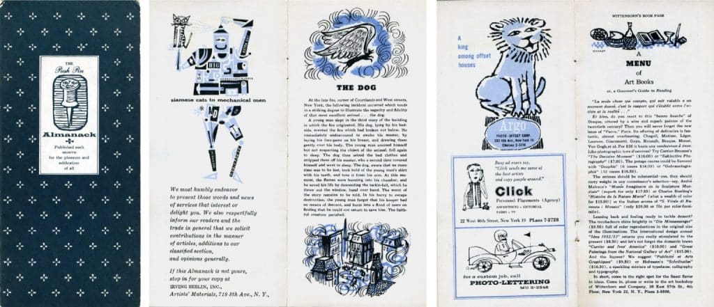
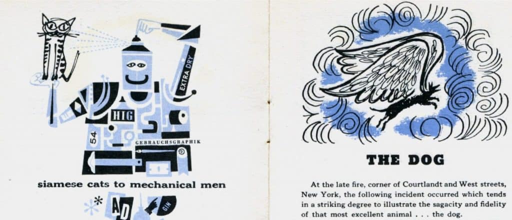
The Push Pin Almanack is quickly becoming a more ambitious publication, the Push Pin Monthly Graphic. Self-publishing well ahead of its time. Soon their baroque and colourful style, made of deliberate borrowings, is plagiarized. The Beatles’ Yellow Submarine video clip, designed by Heinz Edelmann, is a direct continuation of their work.
But Milton Glaser is himself a great pasticheur of popular culture. One will find in his work regular borrowings, decalculated images, reworked paintings. At the time, their only pleasure was to work like a bunch of friends, without hierarchy, without constraints on creativity. We talked about art, politics, philosophy and music. It was the “Bronx” in the offices.
For 20 years, they have welcomed some 20 employees, and probably hundreds of students. The adventure seemed destined to last, but the two pillars Milton Glaser and Seymour Chwast are radically opposed in nature and make the walls tremble. Milton undertook, proposed, advanced. Chwast resisted and refused. Milton was thinking big. He was the optimist. He was interested in creating conditions that would create pleasure.
NARRATOR: As the ’70s dawns, the duo is out of breath. They’re on the verge of becoming an institution. A retrospective at the Musée des Arts Décoratifs in Paris is dedicated to them, followed by many others around the world. It’s time to stop. “We were just a media product, I couldn’t stand it”. The end of this golden age will be signed in 1974, by the discreet departure of Milton. He then created his studio Milton Glaser Inc.
The Milton Glaser Inc.
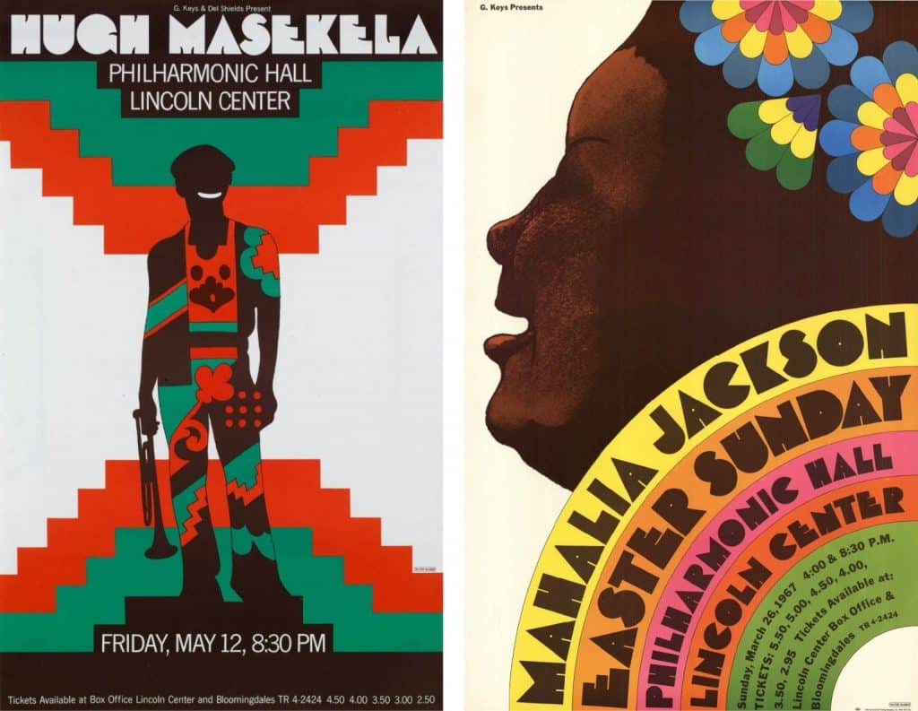
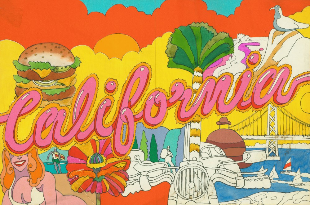
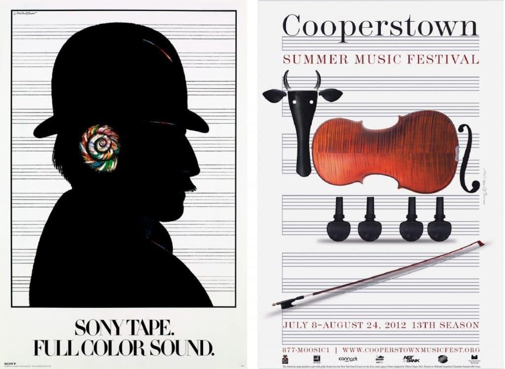
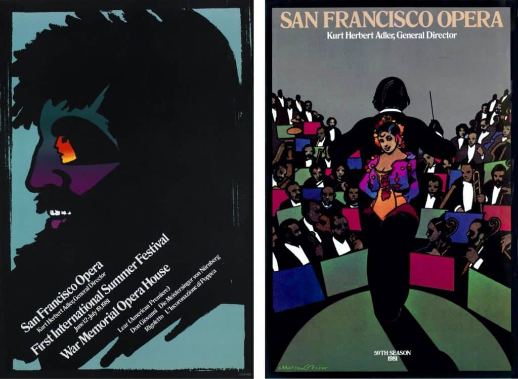
Beginning in 1974, Milton Glaser’s work opened up to a wide range of disciplines. He abandoned independent projects for a while, and used his reputation to carry out major visual identity projects, as well as architecture, signage, publishing and other projects… The promotional identity for the city of New York will be his most publicized work. But he also does interior design for a whole host of clients (hotels, shopping centres, restaurants…). For example, he will be in charge of the entire graphic and decorative program for the restaurants of the World Trade Center, with furniture in 3D typography.


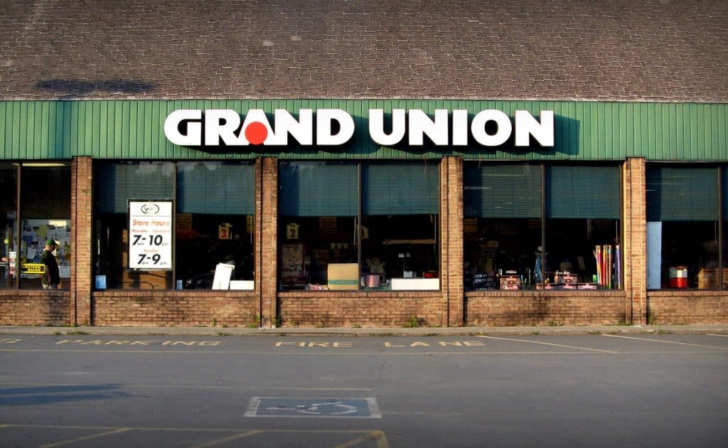
Naturally, if the concert poster remains his favourite medium, he does not refrain from any subject. He designed a number of architectural projects, including Sesame Place, an educational playground for children in Pennsylvania, from 1981 to 1983. For a period of fifteen years, Milton Glaser participated in the redesign of one of the major American supermarket chains, The Grand Union Company, a project that included all the brand identity, store architecture, packaging…
These works are astonishingly simple, the antipodes of the psychedelic effects of the early years. Nevertheless, we find this graphic engagement, like the red dot on the “i” that cleverly provokes our gaze, and points to these stores in the mental cartography of Americans. Milton keeps his clown nose and his childlike look even when he deals with grown-up subjects.
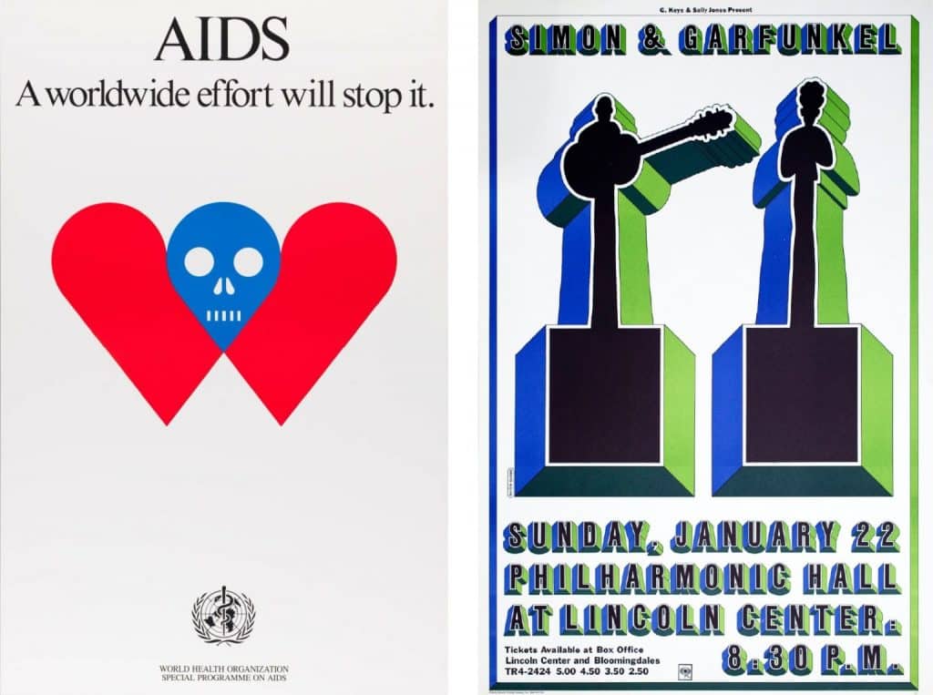
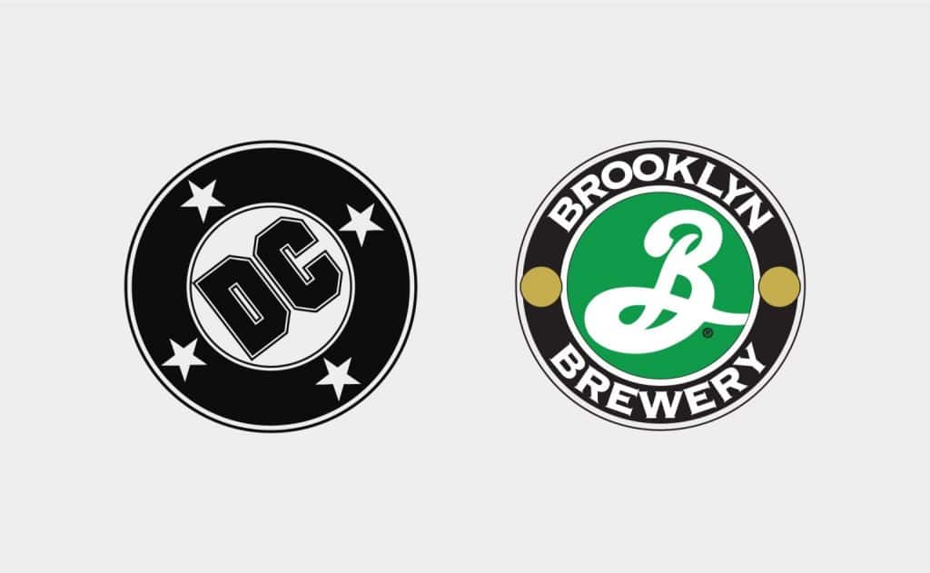
During this period, he was in charge of the stand at the Triennale di Milano 1987-88 international exhibition in Milan and of the graphic program of the Rainbow Room complexes for Rockefeller Center Management in New York. Also in 1987, he created the international symbol of AIDS, the identity of DC Comics, Brooklyn Brewery, etc… We could list hundreds of projects, so long is the list of his achievements. Milton Glaser was prolific, and despite a certain slowdown from the years 2010, he was still working in recent years.
I ❤ NY is one of the most widely distributed and imitated logos in the world. The little red heart, accompanied by the American Typewriter typeface, was born in 1977 to promote the city and the state of New York. Let’s stop for a few moments on one of the major graphic creations of the last century.
New York was going through a difficult period in the 1970s. In 1975, President Ford had just refused federal aid to save New York from bankruptcy, and 1977 was marked by a widespread blackout that led to widespread looting and 4,500 arrests. You might as well know that tourists had left the Big Apple to travel elsewhere. The New York State Department of Economic Development therefore called on the Wells Rich Greene advertising agency to create a tourism campaign to encourage travellers to visit the city.
The agency quickly put in place several central elements of the campaign. A slogan (“I Love New York”), a jingle and a television ad were developed. All they had to do was find the logo. That’s how Milton Glaser came into the picture.
It is said that during the meeting, Glaser took out of his pocket a crumpled piece of paper with a doodle he had made during the taxi ride. On the back of an envelope he had drawn the logo we know today. He did this work entirely on a voluntary basis, and gave all the rights to the City to help revive tourism in his hometown.
He later stated that inspiration may have come to him subliminally with the famous sculpture LOVE by the artist Robert Indiana, whose work appeared at the time on millions of stamps in circulation in the USA. Nevertheless, it remains a visual rebus of obvious simplicity and universal reading. It is Milton Glaser’s Mona Lisa.

Together, his last project during the coronavirus
New Yorker and passionate, with a sense of duty linked to his job as a designer, Milton Glaser was working on a visual to bring citizens (of NY, America, the world) together during the VIDOC-19 pandemic. A bit like in the days of I ❤ NY, in a difficult and frightening context, he sought to “connect people through art”. This final project, unveiled by the NY times a few days after his death, represents the word together (together) treated in a way that visually links people (letters) together despite their differences.
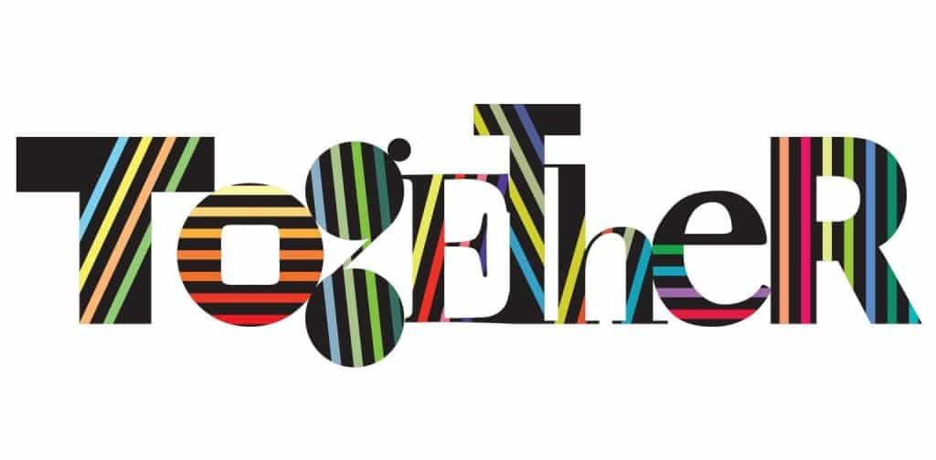
Together is a way to symbolize the phrase “we go through this together” heard hundreds of times in the media. He hoped that one day this symbol would have just as much impact as I ❤ NY has had since 1977, while explaining to the reporter that “after all these years, I still don’t understand what makes an idea attractive enough to change people’s perceptions” and make it change from a simple marketing stunt to a universal symbol.
As he said in his interview with the NY Times, “design starts with the desire to change the state of things, but as I said, the click (in people’s heads, editor’s note) is something you wish for, but you almost never get”.
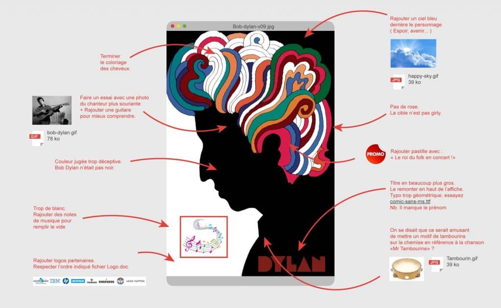
My client is a graphic designer
A few years ago, we were enjoying customer feedback. You know that way some customers get your ideas wrong. We used to use the famous Bob Dylan poster as an example. Milton Glaser, phlegmatic and elegant, knew how to seduce and win the confidence of his clients to impose his ideas. He was uncompromising when necessary.
Milton the colourful humanist
One of the things he was most concerned about in today’s world was that the advertising and marketing world never questioned the consequences of their profession. He always wondered about the consequences of his work, the idea that his images could harm him was detestable. Moreover, he applied the Hippocratic oath (“Do no harm”) in his practice. In the end his images acted as medicine for the eyes and the mind.
The world is shaped by advertising, marketing and capitalism, and the idea that profitability is the heart of the matter was repulsive to him. Yet he had an immense sense of responsibility. “There used to be room for nature, beauty and the search for positive, shared common beliefs. Now it’s about selling stuff. The only criterion for what I do is to increase sales. It’s despicable. “
He liked to repeat that in our business there are three people involved: the designer, the client and the public. None of the three must come first, especially not the designer. On the contrary, it’s the interrelationship that you have to look at, and he abhorred narcissism. The ego should never be misplaced.
His whole life was spent working. The word retirement didn’t exist in his vocabulary. “Retirement is so cold, it’s an illusion created by capitalism, which means that as soon as you need more young people, you can exploit them more easily and pay less money, and then get rid of the old. Our vision of retirement is ridiculous. “
Retirement at 65? For Milton it was a pathetic idea, when he had never felt so useful to society. What he felt there should be was a transition from an active working life to a shared working life, so that all those retiring could be involved with the community, sharing their knowledge.
He was quick to put his speech into perspective, thinking of the masses of employees or workers who have spent a desperate working life, and who despise their work. The next, he could spit in the face of those for whom retirement rhymes with “going fishing or watching TV”. This type of retirement was reprehensible to him, reducing the man to a pecuniary vector.
“If I ever retire, I hope I die the next day.”
As of June 26th, Milton is finally retired. We wish him well, and thank him for all he has given us.
“There are three responses to a piece of design – yes, no, and WOW! Wow is the one to aim for.” — Milton Glaser


